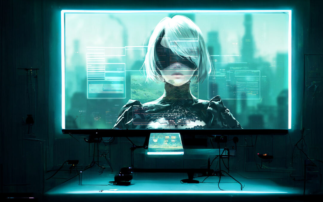
When it comes to video games, art direction is not merely a component of the development process; it is a pivotal visual and highly technical element that shapes the player’s experience, narrative immersion, and emotional engagement.
And among the myriad of titles that have leveraged this principle to craft unforgettable journeys, Nier: Automata stands out as a paragon of how art style can define and elevate a game.
Introduction
Developed by PlatinumGames and directed by the visionary Yoko Taro, NieR: Automata builds upon the foundation laid by its predecessor, NieR: Replicant to deliver a uniquely compelling experience. This analysis aims to explore the art direction ofNieR: Automata, focusing on its art style, making occasional comparisons with NieR: Replicant and other similar games, and examining why this art style has resonated so profoundly with audiences.

Visual Aesthetic:
NieR: Automata is celebrated for its distinctive blend of post-apocalyptic science fiction with undertones of fantasy. The art style marries desolate, expansive landscapes with intricately designed, futuristic androids and machines, creating a world that feels simultaneously alien and eerily familiar. This stark contrast fosters a sense of curiosity and introspection, encouraging players to explore and reflect on the game’s underlying themes. The detailed environments, from nature-reclaimed urban ruins to the cold, mechanical innards of factories, are rich with narrative significance and aesthetic appeal.
Character Design
The game’s character designs are a highlight, featuring a sleek, gothic-inspired aesthetic that sets the protagonists apart from the world’s desolation. Characters like 2B, 9S, and A2 are outfitted in black and white, embodying a balance of elegance and functionality that mirrors their nature as androids. This design choice not only enhances their otherworldliness but also serves as a visual metaphor for the game’s exploration of identity and humanity.
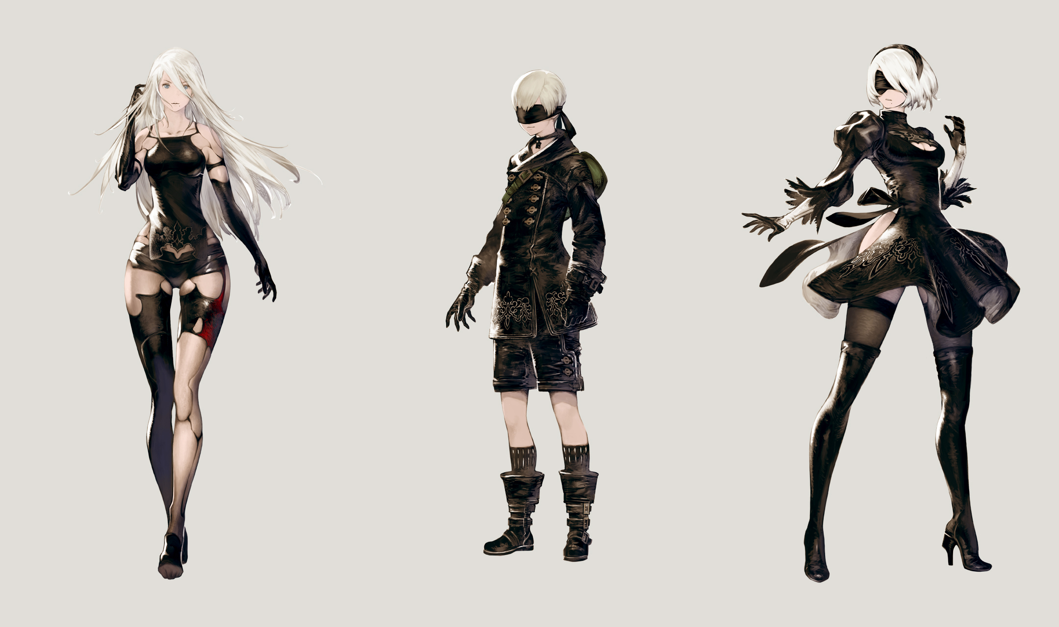
This design choice not only enhances their otherworldliness but also serves as a visual metaphor for the game’s exploration of identity and humanity.
Comparison with NieR: Replicant
Evolution of Style: NieR: Replicant presents a world that leans more towards fantasy, imbued with a sense of ruinous beauty and melancholy. NieR: Automata evolves this aesthetic, adopting a more polished and visually cohesive science fiction direction. The shift highlights a refined artistic vision, maintaining thematic continuity while enhancing the game’s visual and narrative depth.

Distinctiveness from Other Games
Blend of Styles: What distinguishes NieR: Automata from its contemporaries is its adept fusion of artistic influences, from anime and manga to Western sci-fi and post-apocalyptic motifs. This eclectic mix establishes a unique visual identity that is both intellectually stimulating and broadly appealing, setting it apart from games with a more singular aesthetic focus.
Success Factors
Emotional Resonance: The art style’s success lies in its capacity to evoke emotion and deepen the player’s connection to the game’s themes. The visual desolation not only adds to the atmosphere but also mirrors the narrative’s exploration of solitude, loss, and existential search, making the art an integral part of the storytelling.
Narrative Integration: The art style’s triumph is also due to its integration with the game’s narrative. Every visual aspect, from character design to environmental detail, carries narrative weight and enriches the story, ensuring that the art is not merely decorative but essential to the game’s narrative fabric.
Innovation and Familiarity: By striking a balance between the novel and the nostalgic, NieR: Automata appeals to a wide audience, offering a visually unique world that resonates on multiple levels.
The art direction of NieR: Automata is a testament to the power of art style in video games, demonstrating how it can not only define a game’s aesthetic but also enhance its narrative, emotional impact, and player engagement. Through its comparison with NieR: Replicant and its distinction from other titles, it becomes clear that NieR: Automata is a landmark achievement in video game artistry, owing much of its success to its innovative and evocative art direction.
Areas for improvement
Although NieR: Automata is a pinnacle of visual achievement, as with everything, there is always room for improvement. The game’s environmental design occasionally suffers from repetitiveness and lower texture quality, which might lessen immersion and induce monotony during extended exploration. Additionally, despite the unique and thematically rich character designs, the variety in enemy design, particularly among machine lifeforms, is somewhat lacking, leading to visually repetitive combat encounters.
The game’s subdued color palette, while fitting its post-apocalyptic setting, sometimes fails to accentuate key narrative moments with vibrant colors, potentially reducing their impact. Enhancing environmental diversity, increasing enemy design variety, and using color more strategically could significantly improve the game’s art direction, making its world even more captivating and visually engaging.
Concluding thoughts
In conclusion, NieR: Automata stands as a monumental achievement in video game art direction, skillfully blending post-apocalyptic and science fiction elements with a gothic-inspired aesthetic to create a visually stunning and emotionally resonant world. Its art style not only defines the game’s atmosphere but also deepens the narrative, exploring themes of identity, humanity, and existentialism through its meticulously crafted environments and character designs.
What we do
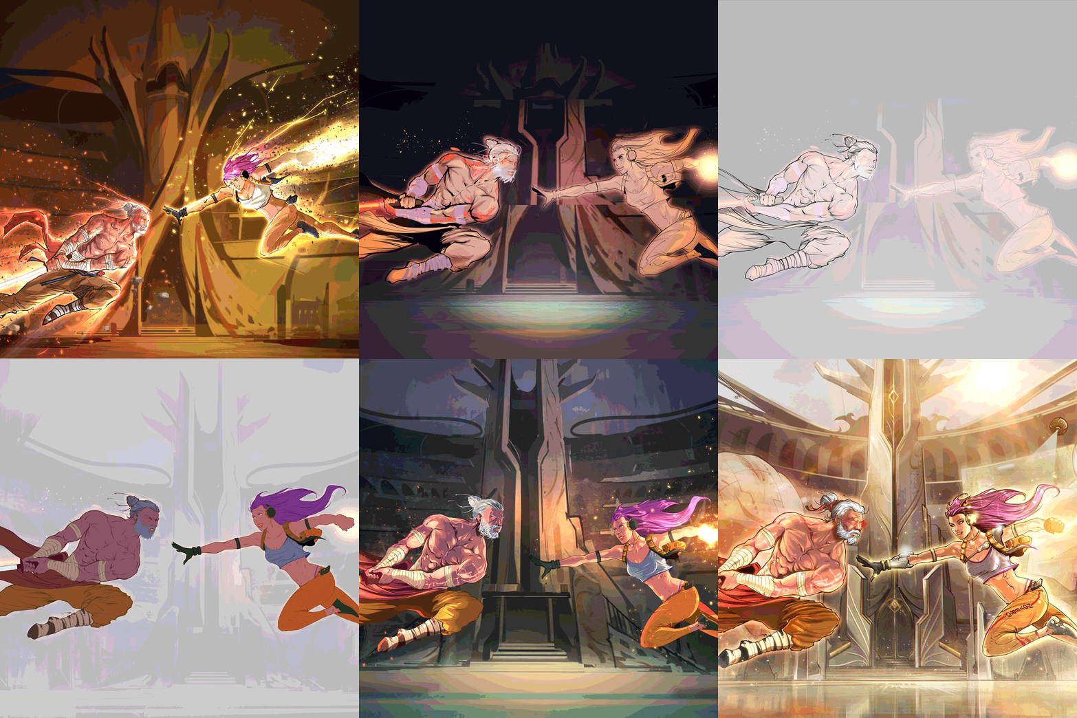
Key Art
KEY ART, PROMO ART & COVER ART.
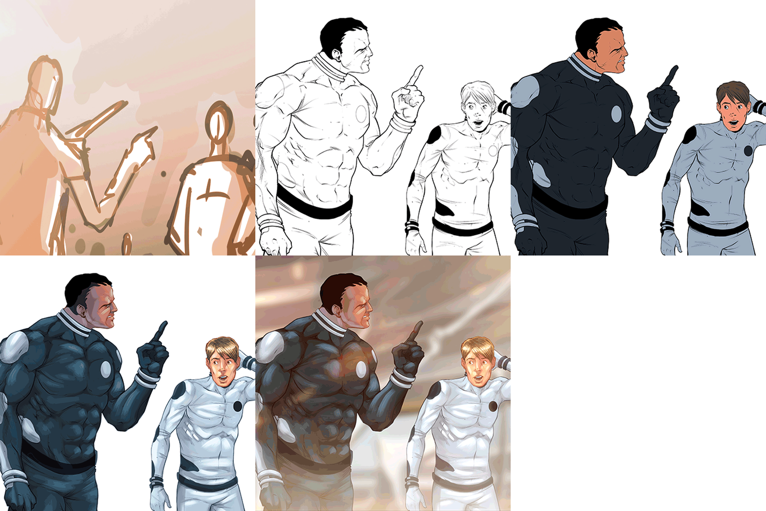
COMICS & GRAPHIC NOVELS
STORYTELLING, ART PRODUCTION, BOOK DESIGN

Concept Art
CHARACTERS, ENVIRONMENTS & ACCESSORIES
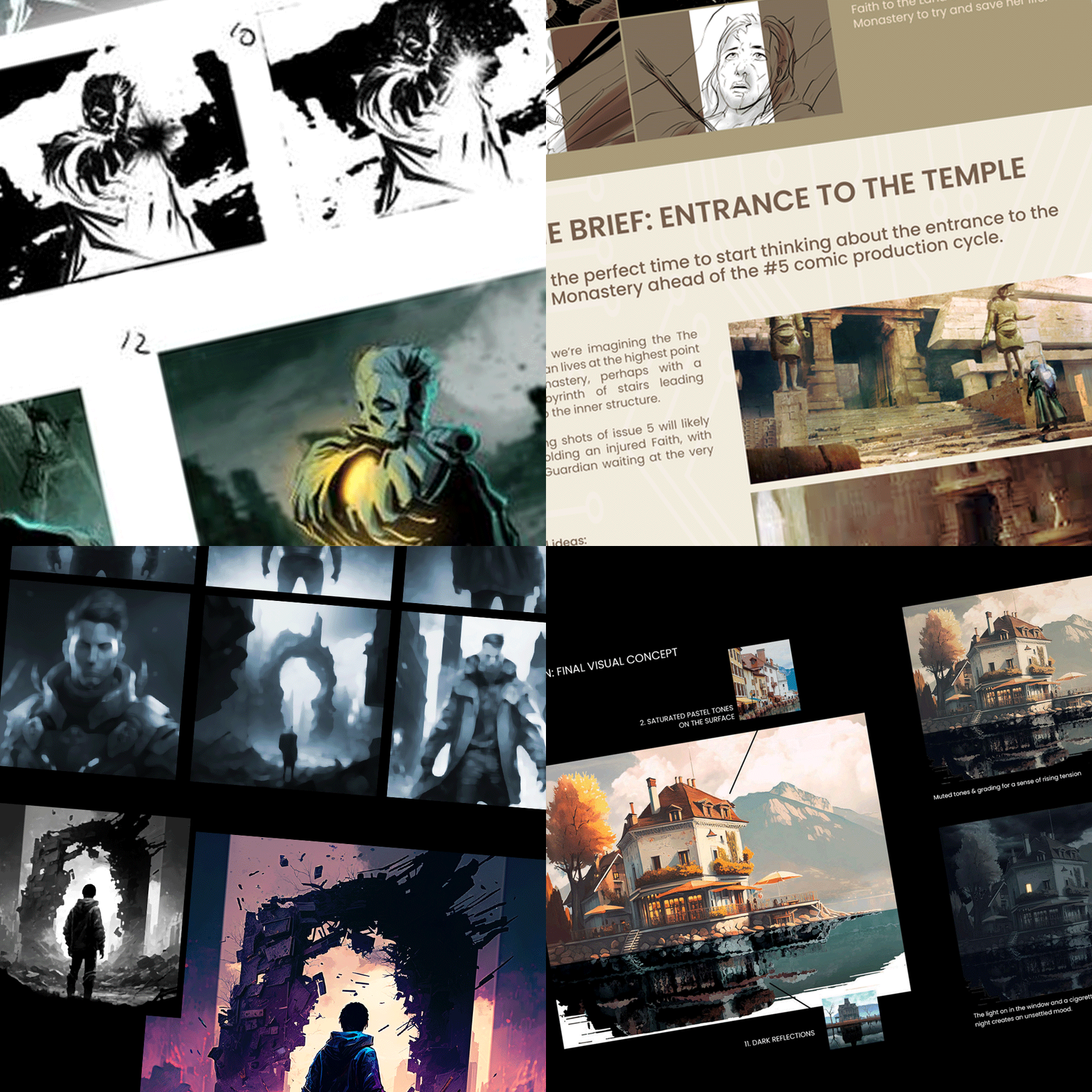
CREATIVE CONSULTATION
ART DIRECTION, EDITORIAL & PIPELINE
Animation
STORYBOARDS, ANIMATICS & MOTION
UX/UI DESIGN
INTERFACES, ICONS & GRAPHICS

